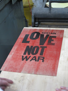
Friends, I've been to the land of letterpress printing, and I have to say, it's pretty awesome. For once in my life, I am intensely conscious of not only the amount of work that used to go into printing anything but also the feeling of power you get when you run the press over a matrix full of type that you set and inked yourself and pull a sheet of paper out that has your work all over it in nice, sticky black ink.
It is a process full of love, and it's hard. Our first project for Art of the Printed Book wasn't actually a book at all, but rather a poster. A protest poster, to be precise. Here's mine.
It is a process full of love, and it's hard. Our first project for Art of the Printed Book wasn't actually a book at all, but rather a poster. A protest poster, to be precise. Here's mine.

Dead Poets Society for the win! I had to keep explaining the poster to people, but I guess that just means more people need to watch DPS. Anyway, this project is part of ongoing events here at CSB relating to the Catonsville Nine, a group of Catholic activists who in 1968 walked into the draft office of Catonsville, Maryland and, taking draft records out of the office, staged a 'peaceful protest' by burning the draft records with homemade napalm. I guess someone said they wanted a revolution.
As a further development of this project in Book Arts, our professor brought in Amos Paul Kennedy Jr., a man very widely known in the letterpress world and quite a character in his own right. Go visit his website and buy a poster -- I'm a fan of this one. His slogan -- Put the message in the hands of the people. He does that but printing posters of his own like the one above, and he discusses topics from books to blackness and back again. Pretty awesome, in-your-face kind of guy. So as part of our workshop, we set up and printed a poster evoking the character of 60s protests but still relevant today. Here's what we came up with:

Pretty cool, yeah? Anyway, Writing Essays was canceled today, so, having a whole afternoon free, I went to the print studio and worked on another poster of my own. And I took my camera to document a little bit.
Wood type before I cleaned the ink off from the first run.Our inking area, where I can mix color and apply ink to the brayers (those roller type things in the middle of the picture.)

Finished product. The text at the bottom is 48 pt. Caslon Bold metal typeface and 62 pt. Caslon bold metal typeface. In case you were, you know, wondering or anything. Total prep, production, and cleaning time? Four hours.
And that's what I came up with. I had to do two runs through the press because that B in Be and Bold? Same B. Limits of letterpress again. And please don't mention the lack of 's' in Catonsville -- I had an s and second-guessed myself after my prof misspelled it on her class handouts. Typo aside, I'm actually kind of proud of it -- incorporates the Catholic social thought involved, draws the situation into the present, might prompt people to do a little more digging into who the Catonsville Nine were. And it's mostly legible from a distance.
My next out-of-class letterpress project? I'm shooting for calling cards.
My next out-of-class letterpress project? I'm shooting for calling cards.


